Tuesday 15 December 2015

CONSTRUCTION: INTERROGATING CHARACTERS

To show how I developed each characters backstory I intend on hot seating them (asking them a few key questions, based on a script that my group and I have devised).I  got the idea from FilmEscape - found HERE

I will interrogate the main available characters that have the most focus in the storyline: Sydney (played by Demi Collins), Aaron (played by Marcus Couling) and Female Migrant (played by myself, Kate Bradford). 
  1. I will write a questionnaire / script (key questions that reveal motivations, character related to the storyline of my trailer/film). 
  2. I will film the interview / hot seating. 
  3. I will present each character interrogation as a short edited video in which I will 'hot seat' the character. 
  4. I will then upload the finished (short) video to my film trailer FaceBook page and elicit feedback for Evaluation question 3. 
Below are some examples, provided by the FilmEscape website, of questions I can interrogate my characters with. I will choose 6 key questions.


Monday 14 December 2015

EXAMINERS REPORT 2015


I read through this extract of the 2015 Examiners Report and made sure I followed the recommendations about BBFC ratings, using a variety of shots, mixing up the narrative arc in the trailer brief, using pace in the trailer brief and signalling the genre clearly. By doing this I will have completed a successful film trailer that follows the appropriate guidelines of the 2015 Examiners Report.

Sunday 13 December 2015

CONSTRUCTION: MIGRANT MOTHER BY DOROTHEA LANGE


My group and I was shown a famous photo of the Migrant Mother by Dorothea Lange connoting social realism. This photo shares similarities with my film trailer storyline that features a migrant mother and baby. Although our storyline is set in modern day (2015, 21st Century), the key emotion portrayed in the Migrant Mother of worry to keep her child(ren) safe and healthy, the desperate need for sanctuary (in the form of a passport to become a citizen in my film trailer) and well-being restored. For Robert Hariman and John Louis Lucaites, the Migrant Mother is also overwhelmingly a photograph about class, and one that evokes not just sympathy but compassion, an impulse to help that crosses social boundaries. The powerful depiction of class difference, also shown in my film trailer between the desperate working class migrants and middle class wealthy Sydney, becomes most obvious when the photograph (or character) is contrasted with other visual images (or another character), influencing empathy amongst the audience.

Another scene in my film trailer that conveys an absent father (and husband) is when Chris is holding a gun up to the migrant mothers head, portraying a sense of loneliness and threat. For Robert Hariman and John Louis Lucaites, the “Migrant Mother” is a single, vivid image, and also a complex representation that draws together the reformist tradition of documentary photography, the pictorial conventions of religious iconography, and the interpellation of the public audience in the place of an absent father. The image provides a powerful pattern of definition that then can be transposed to other times, social locales, and issues, that are still relevant today.

Below is a photo of myself, I play the Female Migrant. 


Saturday 12 December 2015

CONSTRUCTION: EDITING


My group and I looked briefly at the Legend film trailer via YouTube. I chose to analyse Legend (found HERE) as part of my six film trailer analysis' and thought the inter-titles font was extremely eye-catching, dominating and atmospheric due to the bold, opaque and square font depicting the actors and actresses names and slogans. Another aspect of the film trailer I thought was really unique was the word format of the principle actors name, for example 'Tom Hardy is Ronnie Kray' and 'Ton Hardy is Reggie Kray' - this informs the audience that one actor is playing the twins. I had never seen this before in any other film of the same genre and thought this would be fitting for my film trailer. I thought these two areas of the trailer successfully connote the genre and mood of the film that is similar to my murder, thriller film trailer; in turn this can be useful inspiration for font and word formats that would be appropriate for my film trailers inter-titles or films poster.

Example from my film trailer - using inspiration from Legend film

Friday 11 December 2015

RESEARCH: DISTRIBUTION - WARP FILMS

Firstly, I completed research on the FDA website, I watched this video. I previously wrote a post on my research HERE. I learned about the steps completed to distribute a film. For example, once a film has been produced and edited, the film can be distributed. 

I chose Warp Films to distribute my film trailer because they distributed films of the same genre as mine, we agreed that this was appropriate. I learned about the distribution company, Warp Films, on my A Level study day at the BFI Southbank on UK Cinema: Audiences and Institutions on Wednesday 11th February 2015 presented by Matthew Hall. I learn't about the distributors Warp Films and Vertigo, this influenced by choice of distributors for my film trailer. 

I have made a SlideShare presentation explaining which distribution company would present my film trailer and why I chose that company. 


Wednesday 9 December 2015

RESEARCH: DISTRIBUTION

I firstly consulted the website http://www.launchingfilms.com and watched various presentations to help me learn about film distribution. 

Distribution Companies- Top American Film Studios (Big Six) have a Vertical Distribution System
Warner Brothers

Disney
Universal Studios
Paramount Pictures

20th Century 
Fox 

Sony 

Independent film distributors 
Lionsgate

Momentum Pictures
Metrodome
 
The first point distributors assess when they are deciding whether a film is worthy of distributing:  
Define the audience, attracting and addressing the audience. 
 
  1. Who will want to see it

  2. Why will they want to see it

  3. How will they be persuaded and to deliver the audience to the fill

  4. (Is it a 'Niche' film – small, specialised audiences such as French films, Scandi-noir, Art House Cinema
)

Mark Batey: the Chief executive of the FDA

“Launching them (films) to audiences” is “Highly competitive”. He describes the Market place as "highly strategic”


Film Festivals to advertise and distribute films to audiences 
Sundance
Toronto
London
SXSW
Cannes

Most successful way of attracting audiences is the in-cinema trailer giving the audiences a realistic view of the film. 
 
  1. Establish the Genre

  2. Find its USP – UNIQUE SELLING POINT (hook, one line to describe and understand the film) such as the actor, cast, director, location, genre, theme

  3. Target Audience - Frequent cinema goers are often in 15 to 24 age group or families (defined in age groups). 
  4. Distributors to attract as many people to watch audience – who will see the film, why and when to release the film at the best time, how can you put it into the market place with the best possible chance of succeeding such as in the school holidays or before Christmas in different territories such as USA, China, England (trying to prevent piracy)

  5. Research – research audiences (someone who they may think would watch the film – target audience), questionnaire, what appeals to the audience, asks personal questions about whether they would watch a film like this (projects a section of the film) and then get feedback via questionnaires online or on paper

Tuesday 8 December 2015

RESEARCH: FILM MAGAZINE FRONT COVER ANALYSIS #3

Below is my film magazine front cover analysis for The Hollywood Reporter Magazine (February 2012). I have researched and analysed the codes and conventions of a professional film magazine front cover to gain a better understanding of how I can successful produce a film magazine front cover, as part of my ancillary project, to attract and address my target audience.

I made this presentation in Emaze. Emaze is an extremely useful presentation tool as it allows me to quickly and efficiently upload a Power Point presentation or make my own using unique, vibrant and eye-catching tools.

Powered by emaze

RESEARCH: FILM MAGAZINE FRONT COVER ANALYSIS #2

Below is my film magazine front cover analysis for Total Film Magazine (Summer 2011). I have researched and analysed the codes and conventions of a professional film magazine front cover to gain a better understanding of how I can successful produce a film magazine front cover, as part of my ancillary project, to attract and address my target audience.

I made this presentation in Emaze. Emaze is an extremely useful presentation tool as it allows me to quickly and efficiently upload a Power Point presentation or make my own using unique, vibrant and eye-catching tools.

Powered by emaze

RESEARCH: FILM MAGAZINE FRONT COVER ANALYSIS #1

Below is my film magazine front cover analysis for Empire Magazine (February 2011). I have researched and analysed the codes and conventions of a professional film magazine front cover to gain a better understanding of how I can successful produce a film magazine front cover, as part of my ancillary project, to attract and address my target audience.

I made this presentation in Emaze. Emaze is an extremely useful presentation tool as it allows me to quickly and efficiently upload a Power Point presentation or make my own using unique, vibrant and eye-catching tools.


Powered by emaze

Sunday 6 December 2015

PLANNING: A QUESTION OF IDENTITY FILM POSTER - USING INDESIGN

In class today I began to experiment with Adobe Indesign.

After collecting thumbnails of social media platforms I can use on my film poster (and start updating to attract and address an audience with photographs and videos of the film trailers progress) such as Pinterest, Twitter, Instagram and Facebook and writing the films credits and institutional information, I began to experiment on Adobe Indesign.

I experimented on Adobe Indesign to know what software is used by professionals and how they successfully use it to produce posters, like mine, to attract and address their target audience.

This was the photo I took in the previous lesson and imported it into Adobe Indesign

Below are the steps I took experimenting with Indesign to create a mock poster for A Question Of Identity. 

I learned how to add text to my page - the film title is seen above


I learned how to add a photo and project it through the text


I projected the trees from the image I took last lesson through the text


I learned how to change the shape of text - I could use this when I type out the title or actors/actresses/director/slogan/coming out date

My final poster with a title, photograph on the main protagonists, and institutional information and credits - I also experimented with other ways in which I can change the shape of text and add shapes to attract and address audiences.

PLANNING: A QUESTION OF IDENTITY FILM POSTER

Today in class I began to plan my film poster for A Question Of Identity. 

I began by saving images of thumbnails for social media platforms that I can use on my film poster to attract and address my target audience.
Thumbnails for social media platforms I will use - Facebook, Instagram, Pinterest and Twitter

I have been updating the film trailers Instagram page - found on the right side of my blog roll.

HERE is a post I made on making my film trailers Instagram page.


I then started to write the films credits with my group. This will be put at the bottom of the poster in the font Bee Two. I will use this font to make my films poster look professional, like the Thor poster I looked at to gain codes and conventions of film posters and know the right format I should be writing the actors, producers, director of photography's name in - as seen below.


Credits I wrote

I then decided that I would take a photo that I can use to plan and experiment with Adobe Indesign in the next lesson. This photo isn't going to be used in the real poster I will make, but gives me a good idea on how I can structure the characters I want in my photo, how I want the mise-en-scene to look, the camera angle and lighting to be used to create an eerie, questionable and sinister atmosphere.

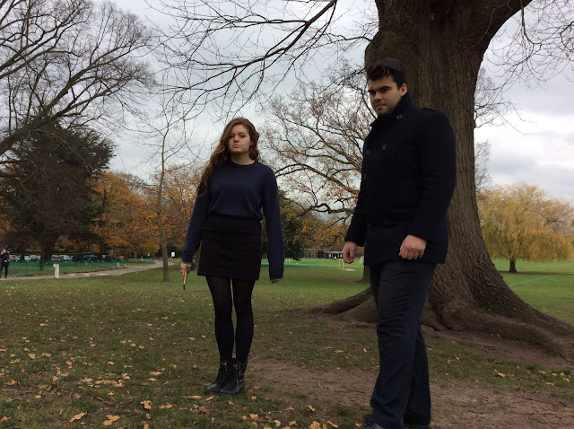
Experimental photograph to be used in Adobe Indesign - with the characters Sydney and Aaron, the two protagonists


RESEARCH: FILM MAGAZINE FRONT COVERS


http://www.world-newspapers.com/film-magazines.html


I have started to research professional film magazine front covers, such as those from Empire Magazine and Studio Magazine. From completing this research it gives me a broader understanding of the codes and coventions used by professionals to attract and address an audience, to not only buy the film magazine but lure and entice them to view the film at the exhibition stages. This gives me a good idea on how I can structure the characters I want on my film magazine front cover, how I want the mise-en-scene to look, the camera angle and lighting to be used to create an eerie, questionable and sinister atmosphere.

Tuesday 1 December 2015

FEEDBACK FROM FILMING AT THE GRAVEYARD

I asked on social media platforms for feedback on my production company ident. Asking for feedback will allow us to have a better understanding on what our audience likes and dislikes (to improve our shots); allowing us to have a high chance of producing a successful film trailer attracting audiences to come and watch the film at the exhibition stages.

As of yet, I haven't had any feedback given on social media platforms, however Pearl Brown, 60, Surrey who doesn't have Instagram or Twitter commented saying "I love the dark, sinister and haunting feel of the grave yard!".

I also asked:

Catherine Lowe, 29, Hampshire, "I think the grave yard is a really atmospheric part of the trailer due to the low lighting,

Ruby Howard, 24, Surrey, "I think the grave yard is really spooky! It makes me wonder how Sydney died - whether she was murdered or she died naturally!"

Olivia Jenkins, 47, West Wales, "I love the way Aaron collapses onto the grave - it adds emotion, sympathy and pity for Aaron dealing with his sisters death!".

Geoff Jenkins, 60, West Wales, "I agree with Olivia! I think the combination of Aaron collapsing onto the grave makes me feel sad, sympathetic and pity Aaron dealing with his sisters death. He must be so confused and desperately want to avenge her death! This shot makes me not only want to carry on watching the trailer, but follow the films process on social media platforms and view it at the cinema!".

I posted this on Instagram and interconnected with Twitter allowing me to have a variety of feedback from people of different ages, genders and locations in the world.


Instagram post


Twitter post


PLANNING: SOUNDTRACK

Today we continued editing the completed footage uploaded onto the iMac using iMovie. My group and I want to create a smooth transition between each frame therefore making our film trailer easy to follow, understand and not jumpy. This is important as I want to audience/viewer to be able to follow the story line easily without getting distracted or confused with unnecessary transitions such as shots fading in and out creating a dodgy, unfocussed transition. 
I decided that when we come to making the soundtrack that it would be appropriate to to create a mix of melodies (making mashup music) for our film trailer, making ours orginal. For example I thought it would be fitting to amplify a constant beat of a keyboard rhythm whilst slightly muting a synthesised track in the background. I also thought about the wild sound of our thriller trailer such as walking of footsteps, wind and breathing, amplified and noticeable over the top of the music. I want to do this because I want to make Aaron's exhaustion and desperation noticeable by the exhausting journey he has taken to avenge his sisters death and find the killer.

I think my group and I want to have fast paced music to accompany the shots as it would suit the detective, thriller genre, theme and storyline of our film trailer - focussing on murder and the urgency to avenge loved ones death who was killed by a brutal, abusive attacker.

I also feel that the fast paced music would suit the fast paced shots such as Aaron running through open spaces such as carparks in dark, eerie and dangerous locations; this would also add even more pace to shot, also adding suspense and tension.
From completing my FutureLearn course and studying a weeks focus on copyright music, I will take the information I have learned into consideration.
HERE is a link to a blog post I wrote on copyright music during week 4 of my FutureLearn Digital Filmmaking course.


Monday 30 November 2015

CONSTRUCTION: INITIAL STAGES


My group and I started the editing process. After filming sessions we made sure to go back to the Media Studios and upload the footage from the camera we have used onto a Mac; this will allow us to stay organised and efficient keeping all of the footage in one space at school. We can all view this footage as well so when we have free time we can join together as a group and edit footage together saving time. 

We started initial editing stages by looking through all of the footage we have filmed, looking out for out of focus footage and wobbly footage when the tripod could have been placed unevenly. Looking out for errors such as these will allow us to stay efficient as we will know if we need to re-film footage and plan ahead. 

We intend on coming back to editing next lesson. 

CONSTRUCTING: RE-FILMING AARON AT THE GRAVEYARD SCENE

My group and I travelled to St George's Church Cemetery in Esher, Surrey to film the grave yard scene for our film trailer. The shots we had to film included an establishing shot of the grave yard visibly showing the church in the background and head stone creating a sinister, dark and negative feel to the trailer as well as an extreme close up shot of Marcus (who plays Aaron, Sydney's brother). The extreme close up shot of Aaron (looking at Sydney's grave stone) would convey a strong sense of sadness, vulnerability and bereavement creating an emotional yet questionable atmosphere. This questionable atmosphere being created would attract and address audiences to come and view them film as they would be wondering why Aarons sister died and whether he played a role in her death.

We decided that it would be appropriate to film the same shots as before when Marcus and I filmed. We experiment with different camera angles and shots, going against the shot list, however we both thought it would be useful to have a variety of different camera angles and shots when we come to edit the footage just in case some shots were out of focus and we could use some of the new shots instead. Camera angles and shots we also filmed included: 

1. A planning, close up shot of Marcus sitting on a bench in the cemetery highlighting his vulnerability, isolation and loneliness in the empty cemetery. 
2. A one person, tracking shot of Marcus opening the cemetery gate and walking towards his sister, Sydney's grave, taking off his leather jacket and placing it on the grave.
3. A point of view shot of Marcus opening the gate of the cemetery, walking through the grave yard (with his trainers visible in the camera shot) showing the head stone of grave as well as him placing his leather jacket  onto the grave stone.
4. A panoramic, panning shot of the grave yard showing the church and grave stone visibly in the background.

Below I made a collage of the photos I took whilst filming using Fotor. Fotor is an extremely useful tool, like PicMonkey, that allows me to make a variety of different eye-catching and colourful collages of photographs I have taken attracting and addressing audiences to my blog. 


Below are a selection of videos I took using my iPhone of shooting at the grave yard. 


PLANNING: LOCATION RECCE

My group and I decided that we would re-film the grave yard scenes I had originally filmed with Marcus in October. We decided this would be appropriate as the footage we had filmed was too out of focus to be used. I noticed this when we had uploaded the footage onto the Mac as the screen was larger and had a high resolution compared to the compact screen on the SLR camera. Although this costed us some valuable time when we could have been editing footage, we thought it would be necessary to film as it was the establishing scenes. 


Previous to filming the grave yard scene at St George's Church Cemetery, Esher, Surrey we visited the church to check whether it would be suitable for filming. We wanted to create an eerie, vacant and 'abandoned' feel to the scene. We agreed that from visiting the location prior to filming we would have an organised, realistic feel of the scene before starting filming; we had an idea about what the grave yard scene would visually look like. We also thought that it would be appropriate for us to go back to the grave yard and view the location prior to filming in case of any changes to the church or building work contracted around the church making disruptive, wild sound to our scenes. 

HERE is a post on filming the grave yard scene originally in October.

I have updated the film trailers Instagram account with photographs taken recently of filming and the editing stages of the trailer project, in turn attracting and addressing our audience. The Instagram page can be found HERE or on the right hand side of my blog roll. 


Below are a selection of videos I have recorded of the grave yard on my iPhone. 


RESEARCH: THE BRIDGE OF SPIES TRAILER


In class we viewed the film trailer for a new, upcoming film due to be released in December 2015 called Bridge of Spies (Steven Spielberg, 2015), starring Tom Hanks. We noticed how complex a film trailer (or professional trailer) is to make and how many shots were used throughout the film. We counted a total of 110 shots used including a variety of establishing shots, close up shots, mid shots and tracking shots - used to convey the storyline and codes and conventions.

By viewing professional film trailers, such as the one above, I have a clearer understanding of how professional film trailers look like and how much effort goes into making a professional trailer attracting and addressing audiences. It allows me to have a better understanding of how I make my film trailer look professional, like Bridge of Spies.

Whilst I was reading The Guardian Newspaper I came across a film poster for Bridge of Spies. This is part of the P&A campaign for the film attracting and addressing audiences. After researching the Visual Hierarchy of Poster Design - click HERE to find my blog post - and completing 3 poster analysis' ( I am working on 3 more) for Black Swan HERE, One Day HERE, Stoker HERE, I have a clear understanding of how I will layout my film poster and what visual reading design I will use such as the Z shape (viewing the poster from left to right in a Z shape) or a F pattern ( viewing the poster in a shape of an F going back to the starting point on the left hand side).

Bridge of Spies P&A I found in The Guardian newspaper

Monday 23 November 2015

FEEDBACK FROM PRODUCTION COMPANY IDENT

I asked on social media platforms for feedback on my production company ident. Asking for feedback will allow us to have a better understanding on what our audience likes and dislikes (to improve our shots); allowing us to have a high chance of producing a successful film trailer attracting audiences to come and watch the film at the exhibition stages.

As of yet, I haven't had any feedback given on social media platforms, however Diana Bradford, 53, Surrey who doesn't have Instagram or Twitter commented saying "I like the quick speed of the ident, it is eye-catching and definitely attracts my attention. Also I looked at the research and planning stages of the production ident, and I thought that it was really interesting how the group transformed their ideas into a unique, dramatic and impressive moving picture. Well done!".

I also asked:

Peter Surma, 55, Cardiff, "I love how quick and unique this ident is! I love how you have incorporated an earth in the motion picture!"

Freya Surma-Litchfield, 20, Cardiff, "I would never able to produce an ident like that! I love how the title 'Blacklight Productions' - its really unique and grabs my attention".

Gabriella Evans, 16, London, "I love the spinning earth!".

Lillian Evans, 16, London, "I love the spinning earth too - it looks really professional! It reminds me of the Pixar ident with the turning lamp. The Pixar ident is memorable; I think yours would be too with audiences!".

I posted this on Instagram and interconnected with Twitter allowing me to have a variety of feedback from people of different ages, genders and locations in the world

Instagram post
Twitter post